💡MFG #15: Decision Paralysis, The P4 Quadrant & Comparison Pages
When NOT to use comparison pages, how to avoid causing decision paralysis, and how to use the P4 Quadrant in planning product/feature launches.
Hi there. Happy new year🎉(2 months late, but still).
Welcome to the 187 new subscribers who joined Marketing For Geeks since the last issue. Big thanks to everyone who shares MFG with their network.
Every month, I share 1 interesting thing, 3 actionable marketing insights that have helped me become a better product marketer, and 5 pieces of marketing that caught my eye.
ICYMI: In my last issue, I shared MFG’s 2023 Product Marketing quiz and asked you to vote for me in the No-Code awards.
Great news btw…we won! You are now reading award-winning content.
In today’s issue, I discuss when and when not to use comparison pages, how to avoid creating decision paralysis for users, and why you should review personas often.
PLUS I have a guest insight from Bolaji Anifowose, a senior growth marketing leader with expertise in growing B2B SaaS products.
P.S. I’m trying to get to know MFG’s readers more. Could you answer a few questions in this short form if you haven’t yet?
Also, if you’d like to join MFG’s WhatsApp community, please fill this form.
It’s a long one again. Let's dive in!
🔑1 Interesting Thing
In MFG #08, I raved about comparison pages and why they’re a great way to one-up competitors, leverage competitor keywords, and control the narrative to your customers.
What I didn’t say is that comparison pages are an art. In today’s issue, I’ll share when and when not to use comparison pages (and alternatives to use for them).
A quick recap for anyone hearing about comparison pages for the first time: Comparison pages are web pages dedicated specifically for pitting your product against a competitor with a clear goal of showing where you shine over them.
When To Use Comparison Pages
When you’re in a saturated market: If you’re in a red ocean market with many competitors, comparison pages are a great way to stand out. In saturated markets, you have to compete against competitors on many levels and buyers have all the power to choose.
One way to make it clear to them where you stand among the many competitors is by creating comparison pages.When your competitors are more popular than you are: Comparison pages are a great way for new market entrants to steal customers from market leaders. New entrants typically attempt to one-up market leaders with innovation or price. One way to showcase where you win over leaders is by directly comparing your product against theirs, especially because new entrants can typically promise better returns on things like price, customer service, and innovation. This is probably the best context to use comparison pages.
A great example is the famous Mac vs PC campaign Apple ran to unseat Windows PC.When people already compare you to competitors: If your audience already compares you to competitors, comparison pages make their decision easier. E.g. Piggyvest vs Cowrywise, Flutterwave vs Piggyvest, Simpu vs Engage.so.
If you can already see search volumes for keywords comparing you to competitors (e.g. “Cowrywise vs Piggyvest”, Alternatives to Grey Finance, “Best email marketing software”), then it’s definitely time for you to consider doing a comparison page.
How To Do Comparison Pages Right
Here’s a secret about comparison pages: they’re not necessarily about which product is better. Because whoever writes the comparison page gets to control the narrative. You get to focus on the things you do better than your competitors (while ignoring or countering anything they might do better than you).
There are a few key things to do to get comparison pages right:
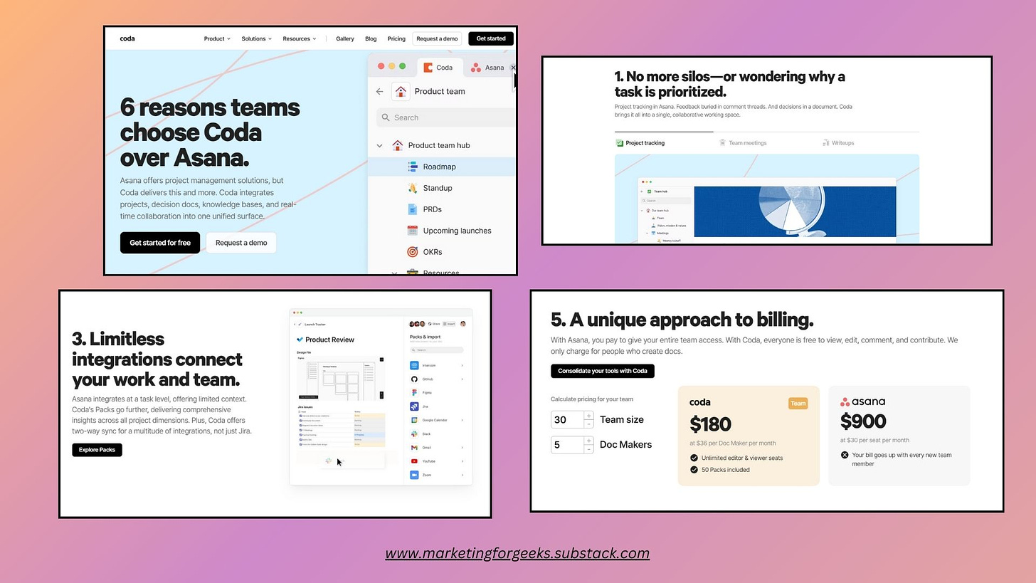
Understand your competitors: You simply can’t do comparison pages right if you don’t understand what your competitors are doing wrong (and what you are doing better). Coda’s comparison page against Asana is a perfect case study in leveraging a deep understanding of your competitors.
Understand your competitor’s audience: Remember that you’re trying to steal customers FROM your competitors. That means you need to understand the pains that your competitor’s customers might be going through and how you win.
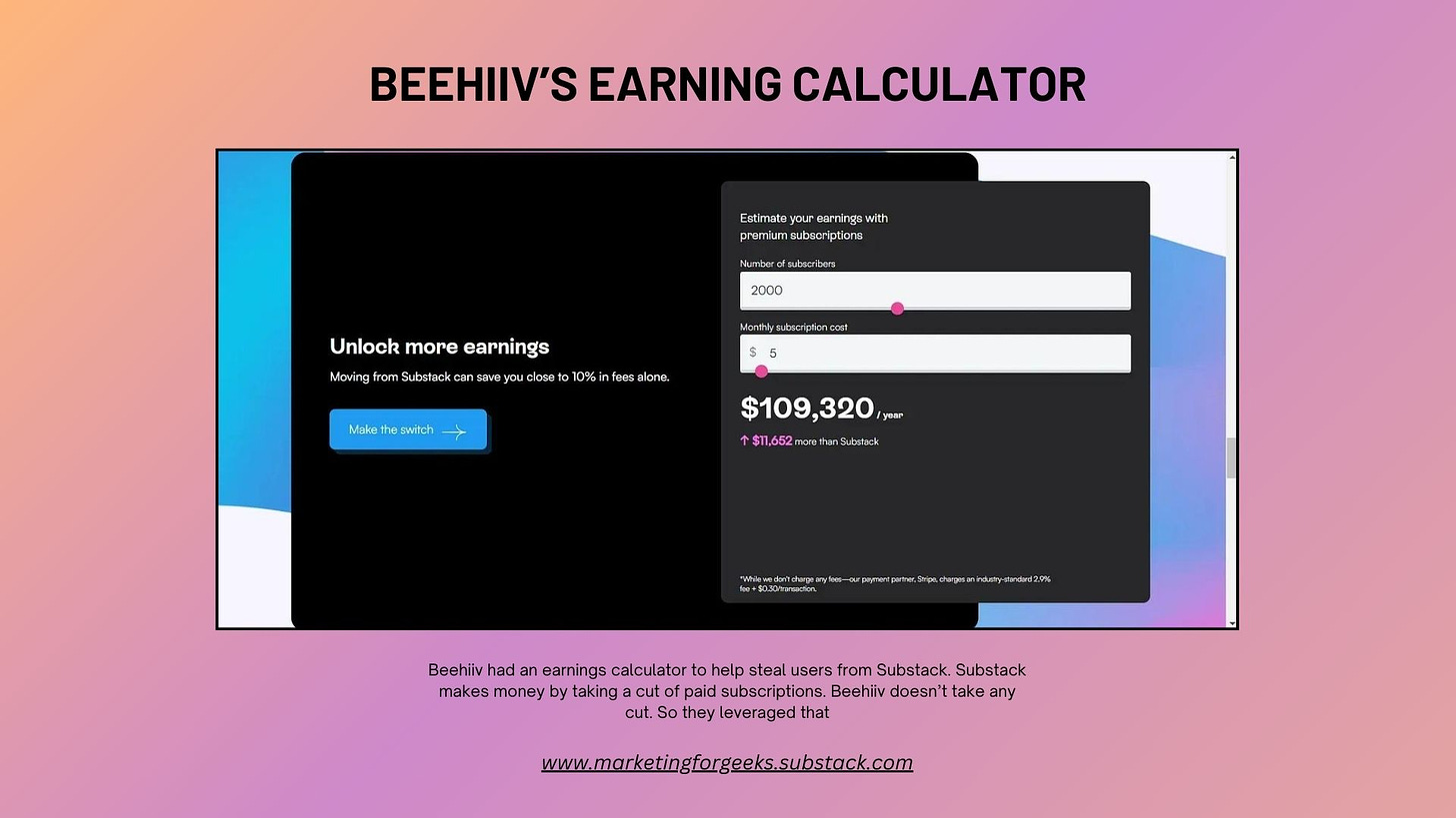
For example, Beehiiv used to have an earnings calculator that showed Substack writers how much they could save by using Beehiiv for paid subscriptions, rather than Substack.That’s a feature that ONLY matters to Substack writers because Substack makes money by taking a cut from paid subscriptions. Beehiiv doesn’t.
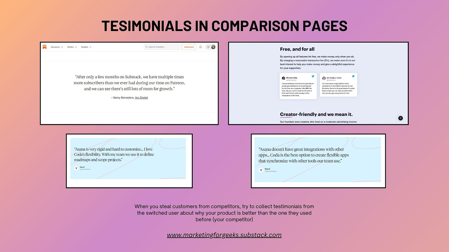
Include testimonials of switched users: The most powerful testimonials and case studies you could use for your comparison page are those of people who switched from a competitor to you.
Reflect your brand voice: Comparison pages give you the best chance to convey your brand’s voice & personality. If you’re warm and friendly (like most creator brands, e.g. Beehiiv, Podia), use language that shows that you care, letting you position your care as an advantage in itself. If your brand voice is manner-of-fact, use language that makes your audience feel like the facts speak for themselves (the facts being that you’re “objectively” better than competitors).
Optimise For SEO: Of course, you have to optimise your comparison page for search. Optimise for high-intent keywords that BOFU users search when trying to compare competing products (e.g. x vs x, best alternatives for x). Marketing Examples has a great case study on how Podia utilises SEO for its comparison pages.
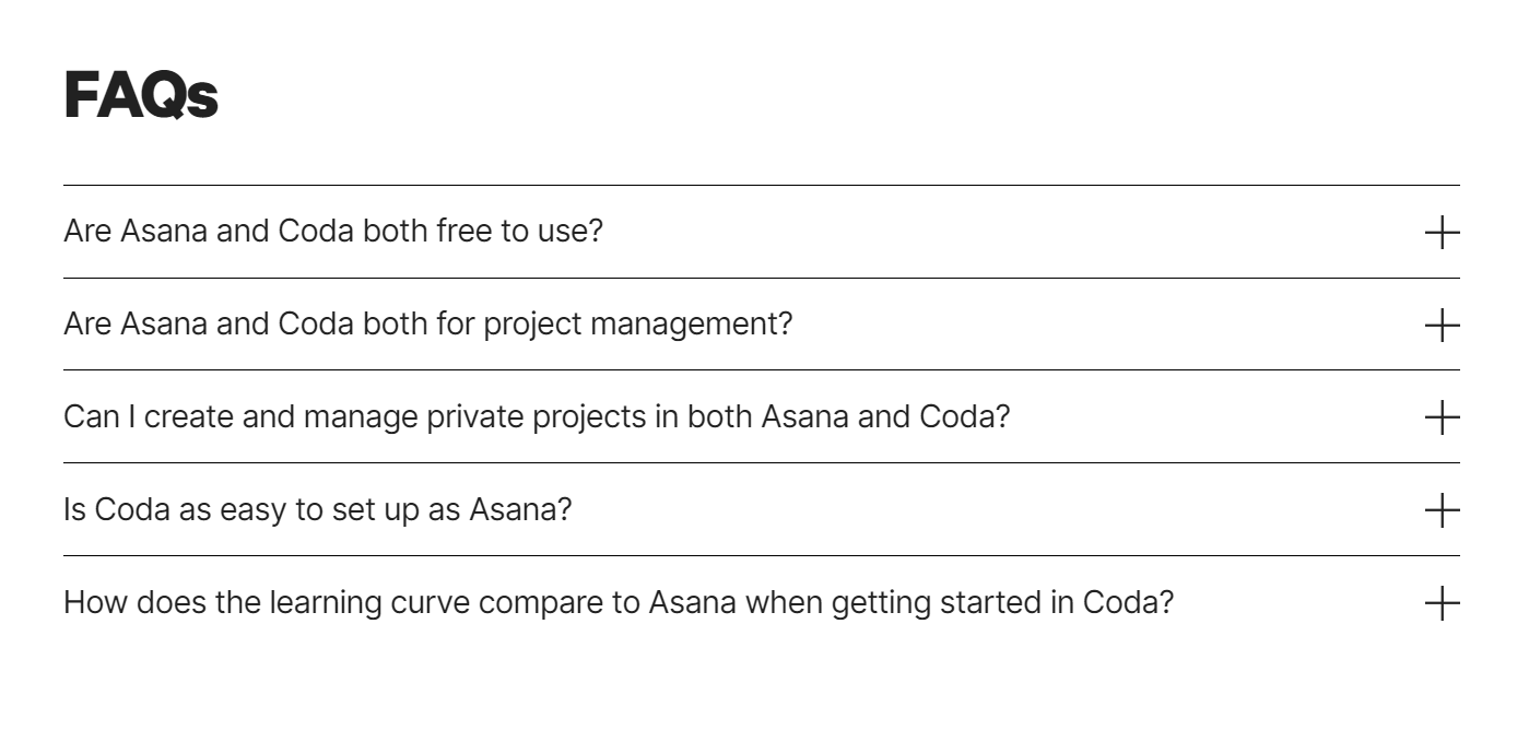
You can also add an FAQ section at the bottom directly answering questions users might be asking about competitors (e.g. how much does x cost, which one costs more, etc), as Coda did.Use a clear CTA: Readers should be able to click CTAs to use your product at any point within your comparison page. Use a floating CTA or place CTAs at multiple points throughout the page. Rather than generic CTAs like “Sign Up” or “Get Started,” use more specific CTAs like “Switch Now” “Make The Switch”
Make the switch easy for users: I’ve spoken about switching costs in MFG #11.
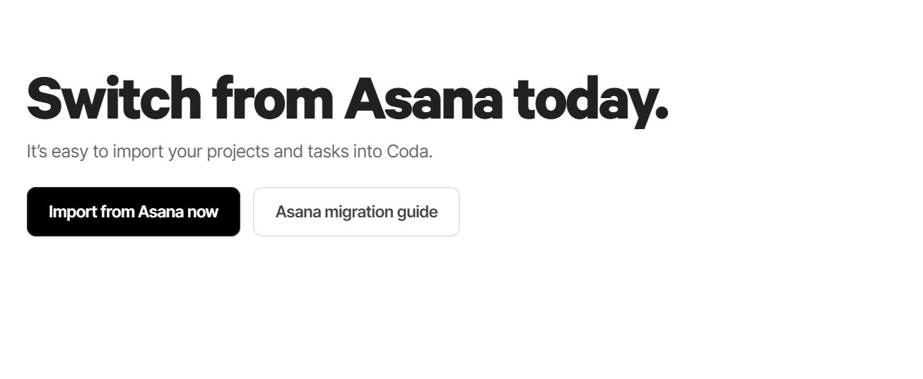
You need to figure out a way to make it easier for people to switch from competitors to you. Coda lets you migrate docs from Asana and provides a migration guide. Beehiiv & Substack let you import your email list and email archive from other newsletter platforms.
P.S. If your leadership team is against doing direct comparisons with comparison pages on your own website, try getting bloggers and affiliate marketers to write comparison articles and reviews that put your product on top.
When Not To Use Comparison Pages
Now that you know when to use comparison pages, we can explore when NOT to use comparison pages. The truth is comparison pages aren’t for everyone or every competitor. So, here’s when should you NOT use comparison pages:
When your competitors are significantly less popular than you are: If your competitor is unpopular or unknown, creating a comparison page might point tentative users to an alternative they hadn’t even considered. So if you have never heard anyone say “What makes your product better than this product?” or “This seems like what xxx product already does”, you probably don’t need to create a page to compare against said product, because you might just be giving the product credence it didn’t have.
When you don’t have any differentiators: Honestly, it’s very unlikely that your product would have absolutely no differentiators from other products (there’s always something, even if it’s better design or customer service).
If you’re a good marketer, you can turn your weaknesses into strengths with your comparison pages.Is your product run by a small company? Say it means you don’t have to deal with the bureaucracy that large competitors with boards have to.
Does your product focus on one core niche as opposed to competitors who provide wider verticals? Say it means you do one thing but you do that one thing well and you’re the best at that one thing.
Does your product have very few users? Say it means that you can focus on each user as if they’re your only user and can give them the attention that big companies with “soulless” customer support teams can’t.
But the truth is that if you feel like you have absolutely no differentiators of note, you’ll have a hard time convincing users to even use you in the first place.
When your industry has rules against comparative advertising: Industries like healthcare, pharmaceuticals, and financial services typically have more strict regulations, which can sometimes deter comparative advertising. But it’s important to know what exactly the regulations say—good chance the regulations only block you from promising things like 100% efficiency or declaring absolutes on volatile things like interest rates.
When you’re in a blue ocean market: If you have no direct competitors, it can be difficult to create direct comparison pages.
What To Do If You Can’t Use Comparison Pages?
If any of the 4 factors above affect your product/business, you’re probably wondering what you can do in place of comparison pages. As it turns out, there’s a few things you can do:
If you only have indirect competitors, compare direct competitors of your indirect competitors against each other while placing your product as the alternative that blows both out of the water.
For example, if Tesla wanted to build more presence in Nigeria, they could compare Lexus and Benz, then position Tesla as better than both of them because it has the added benefit of self-driving features and saved costs on fuel.If you only have indirect competitors, compare your product against the way of doing things before your product. How did people do things before your product and how is your product better than that way?
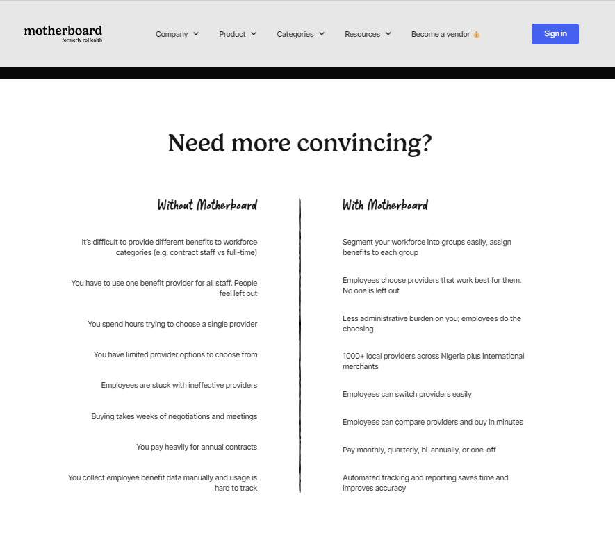
For example, I used this technique for Motherboard, since it doesn’t have any popular direct competitors.If it looks like you have no differentiators, find at least one differentiator. You might not have enough to fill a comparison page, but you could mention them casually in copy on your homepage.
(e.g. “Our lean team allows us ship updates faster than large alternatives like x and x that only release new features every 6 months. Unlike xxx, we release new features every 2 weeks, which means we can—and will—build whatever features you think we’re missing extremely quickly)If you’re in a blue ocean market, create use cases built on testimonials that help potential users understand your product’s USP, especially in the context of the previous way of doing things. (e.g. “Company A used to do xxx to solve this problem and got xxx results or faced xxx problems, now they use our product and get xx results”)
TL;DR (Too Long, Didn’t Read): Comparison pages aren’t for everyone. Understand your competitors, audience, and what makes your product unique before diving in. If comparison pages aren't an option, there are alternatives.
📣Tweet this.
💭3 Insights
#1. Personas are hypotheses and should be reviewed often.
No matter how much research you conduct to develop your user persona, you’d simply be making (informed) hypotheses about your user. Like with any hypothesis, you need to use experiments to prove or disprove your initial hunch. The experiments in this context are all the interactions your user has with your product. Did users behave as you thought they would based on your persona? Did you discover something new about them?
Your first persona cannot be your last. I recommend re-doing the research process every 6 months (if you can) and enriching your buyer persona with new information gained.
This is especially more important if you developed a persona pre-build, pre-launch, or pre-monetisation. Post-launch, you might realise that you missed something about your customer or that you even segmented your customer wrongly.
For example, I segmented personas for a company by the job title (e.g. sales persona, engineering persona) of the user. After real users began using the product, I realised that the department made zero impact on their behaviour; instead, their job type (blue-collar vs white-collar) did.
TL;DR: Personas are like hypotheses; they need testing and iterations. Review them often so they reflect your evolving understanding of your users and are based on real behaviour, not assumptions.
📣Tweet this.
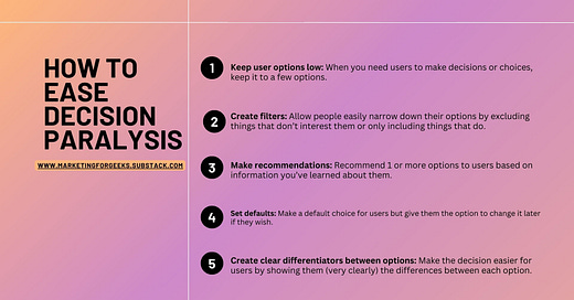
#2. Decision paralysis might be the culprit behind your drop-offs.
Have you ever been in a restaurant that had so many good options that you had no idea what to try? Or tried to choose an ice cream flavour from 20+ options? If you have, you’ve probably experienced decision paralysis. When people have too many choices or even just 2 difficult choices, they can get paralyzed and make the wrong (or impulsive) decision for their needs. Even worse, they can choose to exit completely and take no action at all.
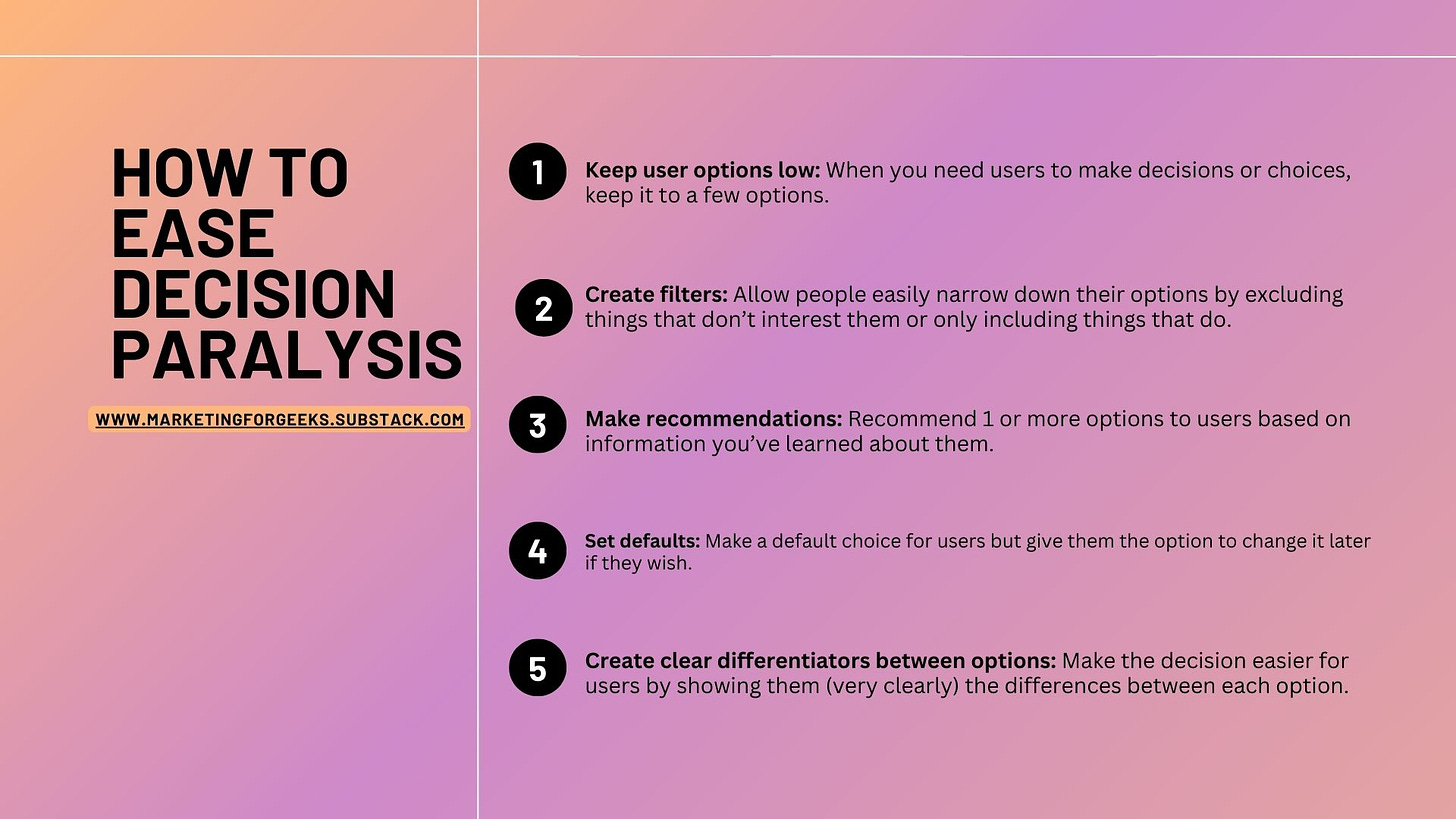
There are a few ways to help with this:
Keep user options low: When you need users to make decisions or choices, keep it to a few options.
Con: This isn’t always possible. E.g. in the ice cream shop example, you can’t simply cut down your menu to vanilla & chocolate.Create filters: Allow people to easily narrow down their options by excluding things that don’t interest them or only including things that do.
Con: Works best when there are a LOT of very diverse options. Doesn’t work when there are fewer than 10 choices with little variations between them.Make recommendations: Recommend 1 or more options based on user info. For example, at Motherboard, we noticed that users had a hard time choosing a health plan when assigned health insurance benefits. So we started including recommended health plans based on the budget assigned to the employer.
Con: You need access to certain user information to make an accurate recommendation to them.Set defaults and give them the option to choose later: When you’re setting up your phone, you don’t get hit with dozens of settings with choices that need to be made. Instead, default settings are set up for you, while you have the option to change them yourself in Settings. You can do the same with your product.
Con: Only works when the choice isn’t a crucial one or when it’s a choice the user doesn’t mind having made for them.Create clear differentiators between options: Make the decision easier for users by showing them (very clearly) the differences between each option.
Con: Only works if choices have distinct differentiators
TL;DR: If you give users too many options, they might get decision paralysis. Help by keeping options low, creating filters, setting defaults, or making recommendations.
📣Tweet this.
#3. The P quadrant system is a great guide when planning product/feature announcements.
Insight from Bolaji Anifowose, Head of Partner Marketing at Distrobird and former Head of Marketing at Simpu.
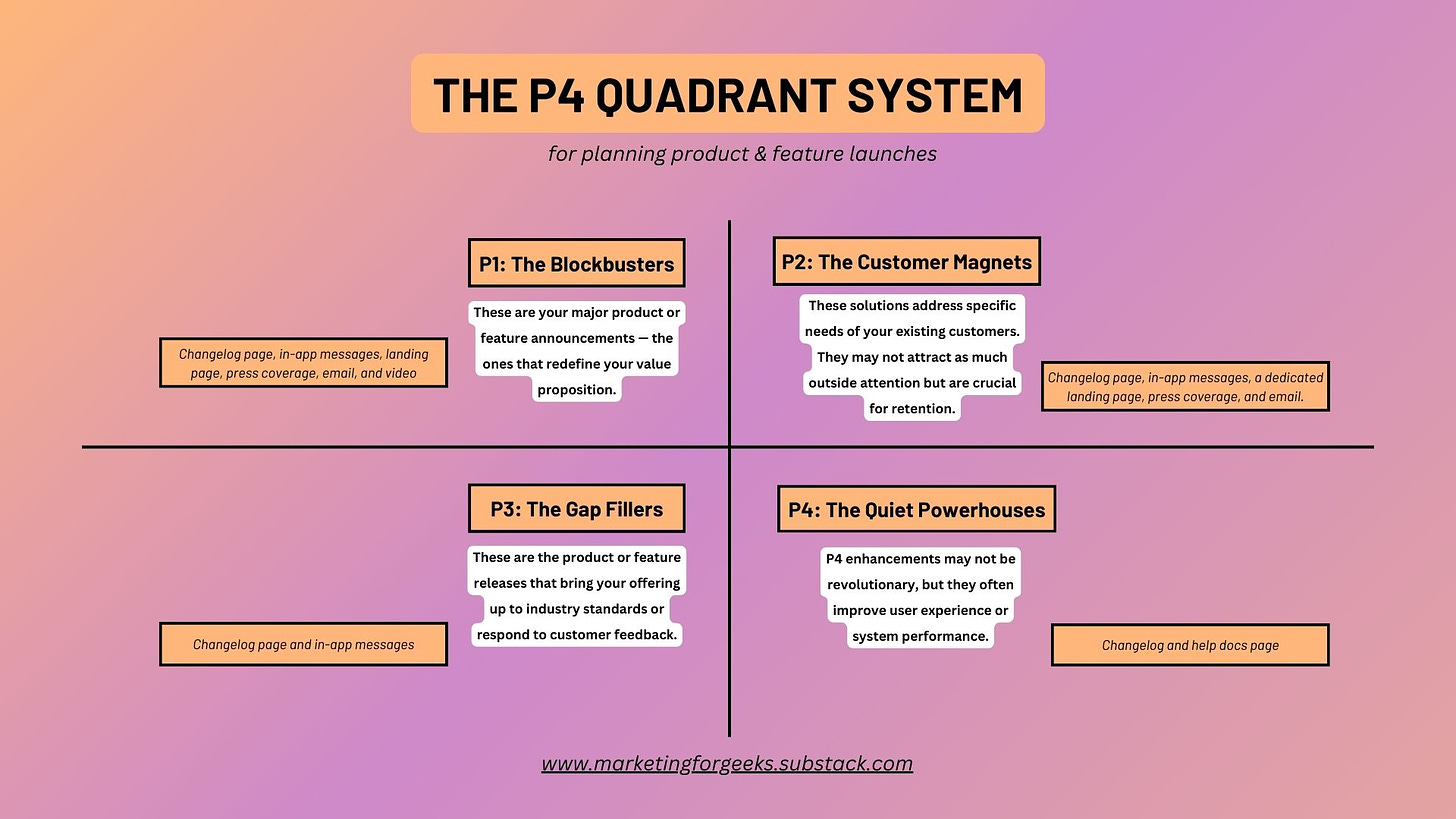
When planning the announcement of a new SaaS product or feature, understanding the impact level is crucial for choosing the right communication channels. The 'P' quadrant system helps clarify this, with P4 representing enhancements or additions that might not be groundbreaking but are still significant enough to merit attention. Here's how to think about announcing your product or feature based on the P quadrant they fall into:
P1: The Blockbusters
These are your major product or feature announcements — the ones that redefine your value proposition. Announce these with a mix of high-impact channels: Changelog page, in-app messages, landing page, press coverage, Email, and video.
P2: The Customer Magnets
These solutions address specific needs of your existing customers. They may not attract as much outside attention but are crucial for retention. Leverage channels like the Changelog page, in-app messages, a dedicated landing page, press coverage, and Email.
P3: The Gap Fillers
These are the product or feature releases that bring your offering up to industry standards or respond to customer feedback. Channels like the Changelog page and in-app messages are often used.
P4: The Quiet Powerhouses
P4 enhancements may not be revolutionary, but they often improve user experience or system performance. They warrant communication through more subtle, educational channels like the Changelog and help docs page.
No matter which quadrant your product or feature falls into, the announcement should be strategic and thoughtful, aimed at engaging and educating your users.
TL;DR: Use the P quadrant to plan product/feature announcements based on their impact level. P1s are blockbuster features. P2s are customer magnets. P3s are gap fillers. P4s are quiet powerhouses.
📣Tweet this.
⚡5 Pieces of Marketing
#1. This install nudge from tl;dv👍🏽
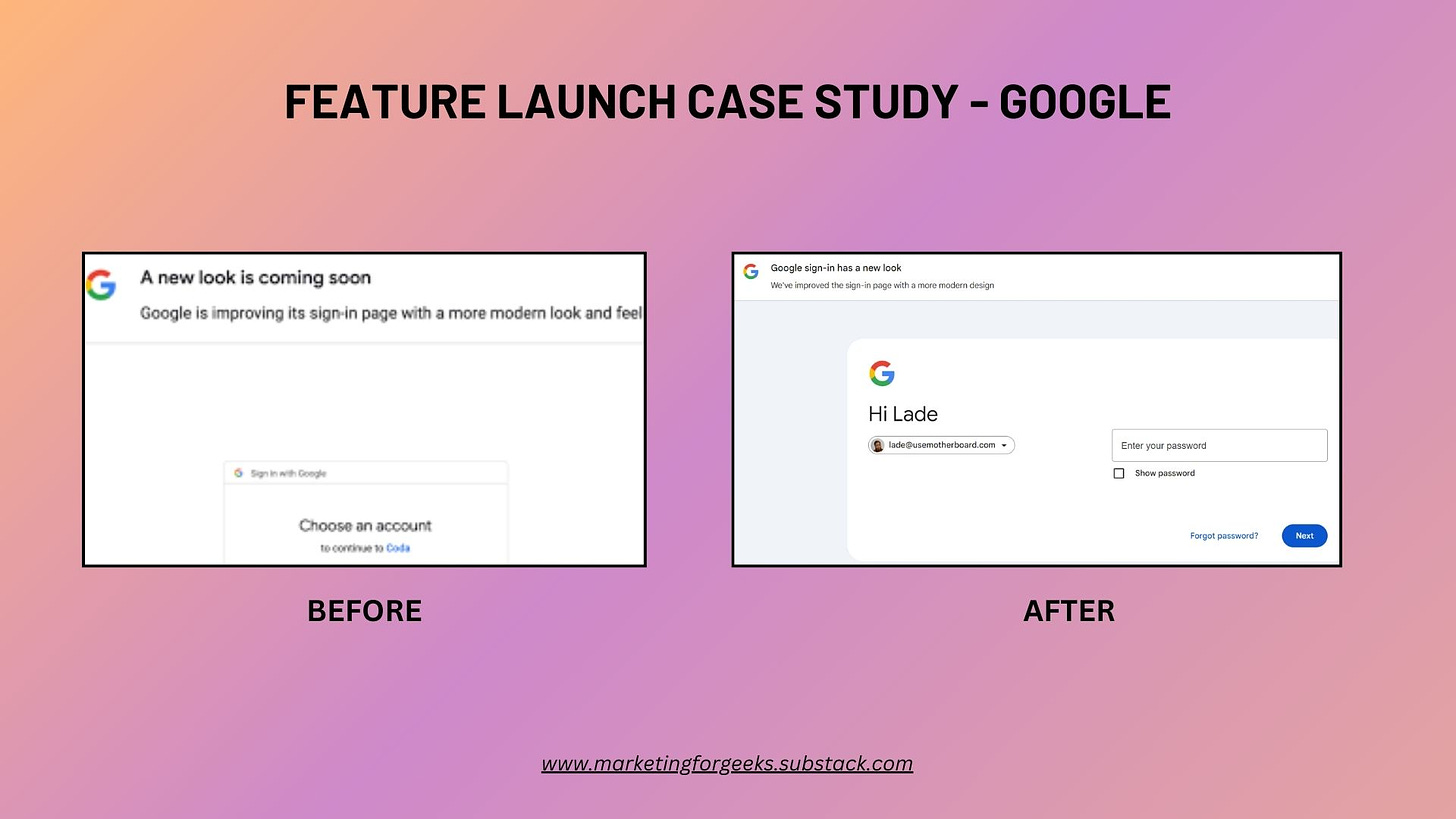
#2. This feature rollout from Google sign-in👍🏽
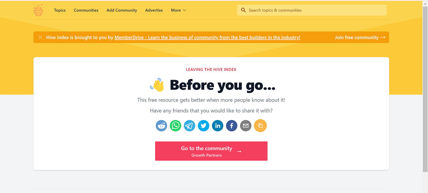
#3. This share nudge from Hive Index👍🏽
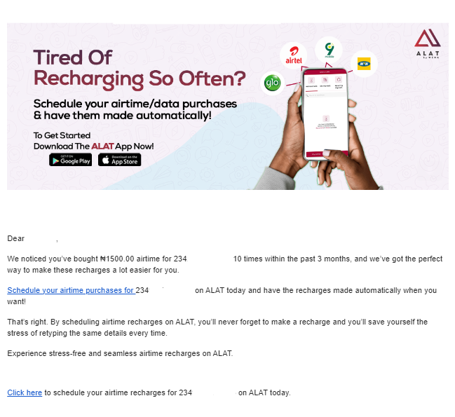
#4. This triggered email from Alat👍🏽
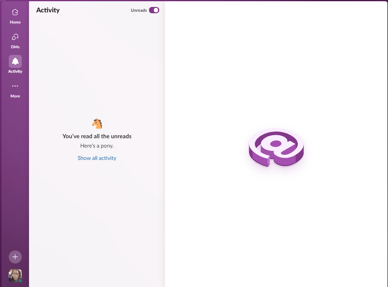
#5. This microcopy from Slack👍🏽
What I’m Reading
Social Proof — Amazing case study from growth.design as usual.
The Ultimate Guide to B2B SaaS Pricing & Packaging — Comprehensive guide on pricing models & strategies for B2B SaaS products + case studies from real products.
The state of SaaS pricing - Insights into why SaaS companies are combining usage- and subscription-based pricing.
Product/Market Fit Surveys for Data Science Rookies — Why you should go beyond Sean Ellis’ PMF survey and try Superhuman’s expanded version.
Beyond NPS - How to Build and Measure Trust with your Customers — Loved this framework Patreon used to measure customer trust.
Did you enjoy this issue? Give it a ❤️ and let me know in the comments section.
Even better, share this with someone.






The share nudge from Hive Index prompted me to check them out, that's how effective copywriting works...
Dropping gems as always! Love the insights you shared on comparison pages and decision paralysis. Thank you for the content formats to highlight a product's strengths.