MFG #01: Data, Bad UX, Content vs Customer Care, and more.
The Science of Marketing, Twitter's beautifully-written privacy policy, X-box's terrible email, and more.
Hi,
I am so excited to send out the first official newsletter from Marketing For Geeks.
I haven't set a posting calendar for this newsletter yet, so I can't promise what specific day you'd get this email each month — but I can promise that you'd get it at least once every month.
Let's dive in!
🔑1 Interesting Thing
For the past month, I have been taking Treford's Product Marketing Bootcamp (P.S. I 100% recommend this bootcamp for anyone who works in marketing or advertising, even if you have no intention of pursuing a career in Product Marketing or Tech).
The Bootcamp has been crazy interesting. The best part for me has been putting theory into practice. For the course, participants have been put into teams and tasked to work on a case study. Which is great. If you like work.
Unfortunately, I do like work, which means I was hyped to work on the case study. I changed my mind about liking work when I opened the case study and saw the very first task included data analysis. LMAO.
I have always detested everything about science and numbers, which is why a career in words (and the art of words) made perfect sense for me.
To now come face-to-face with the science of numbers in a marketing course...you can imagine my trepidation. Unfortunately, marketing results are in the numbers. If you want to know what works or doesn't, you need to know how to read the numbers that matter.
So, for the past couple weeks, I've been getting into the numbers. Surprisingly, I'm enjoying it. Not as much as I enjoy the art of marketing of course, but that's to be expected. I don't think I'd ever fully get into data analysis, but I think it's great to know the basics -- and I think I am a better marketing professional for it.
💭3 Insights
#1. Customers don't "stay posted"
A client recently sent over an article that ended with "stay posted for our next article..." Thing is, customers rarely "stay posted" to your page just because you tell them to. Readers aren't going to keep reloading your blog, waiting for the next article to drop. If you want customers to wait in anticipation for something, you need to do two things.
Give them a reason to stay posted: First, tell them what they're waiting for and make it sound interesting and beneficial to them. You can go further by adding an incentive for them to wait. Building a waitlist? Add an offer to sweeten the deal. Offer a discount for people who join the waitlist.
Make it easy for them to find out once it's ready: "Stay posted" isn't a clear call to action. Instead, tell them to turn on post notifications or subscribe to your email list. Give them a clear action they can take so they know immediately the content or product they're waiting for drops.
#2. It's bad UX to take people out of their comfort zone
Outside-the-box thinking is not always a good thing. Sure, it's great to be innovative. But you need to remember that out-of-the-box designs are not always great for user experiences. My top example of this is Access Bank's ATM sequence. In a bid to stand out (I'm assuming), they have created the most annoying ATM experience. Users are used to a certain sequence when using ATMs. You type in your pin, select the type of account, select the amount, and then withdraw. Access Bank ATMs scatter this sequence. And not in a good way. Deviating from sequences users are comfortable with is usually a bad idea. If you're going to change your UX from your competitors, you need to make sure you're actually creating a better experience for the customer, not just a different one.
#3. Judge a product by how much work customer care has to do
If your customer service department is constantly fielding calls, there's something wrong with your product. Think about banks that constantly have long queues of people waiting at the customer service desk. It is a sign that something isn't working right. This doesn't just apply to customer complaints. Customers shouldn't have to keep asking customer service for help using your product. Make your product easy to use and understand. If you have a product that is naturally hard to understand (e.g. if it's very technical), you need to invest in customer education. Create guidebooks, playbooks, FAQs, explainer videos, etc. If you play in the crypto space, create a course to teach people the basics of crypto. This is also a great way to acquire new customers by the way (and it's a sweet lead magnet)
⚡5 Pieces of Marketing
#1. This cookie pop-up by Al-Jazeera👍🏽
Love that it's not the usual "this site collects cookies blah blah". It fits into AJ's brand purpose beautifully. Even better, it gives you a reason to allow the cookies, while telling you how you can decline them.
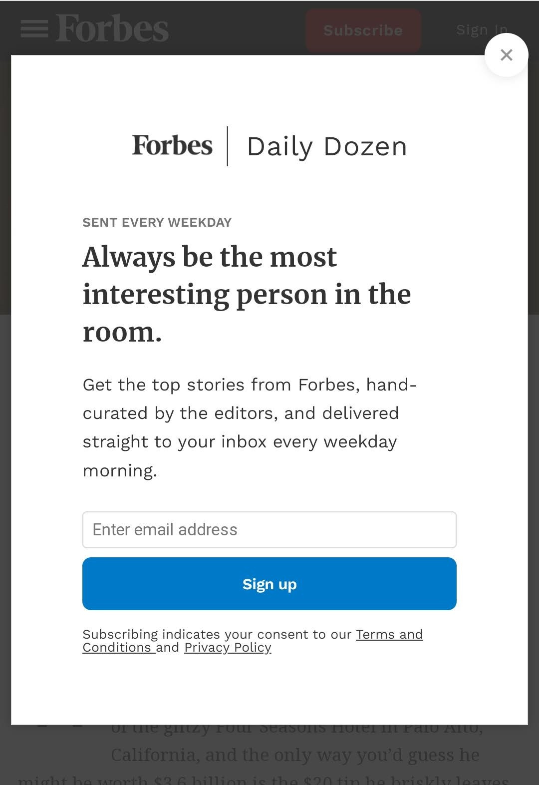
#2. This newsletter pop-up by Forbes👍🏽
The headline is beautiful. Tells you the exact reason to subscribe -- and it's a very precise and true reason to the TA. The pop-up also tells you when you'd receive emails and what the emails would contain.
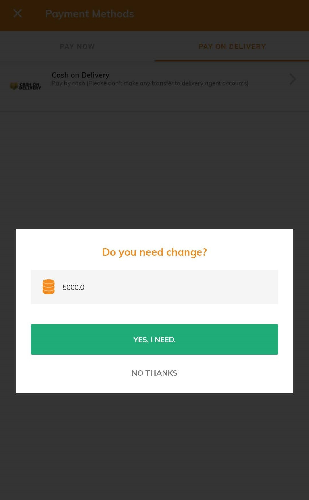
#3. This feature by Jumia Food👍🏽
If you've ever ordered anything and chosen cash on delivery, you'll feel this. Delivery guys rarely have change so you typically have to provide the exact amount for your item or forgo your change. This new feature lets you say how much cash you have so the delivery person can bring sufficient change along. I love it.
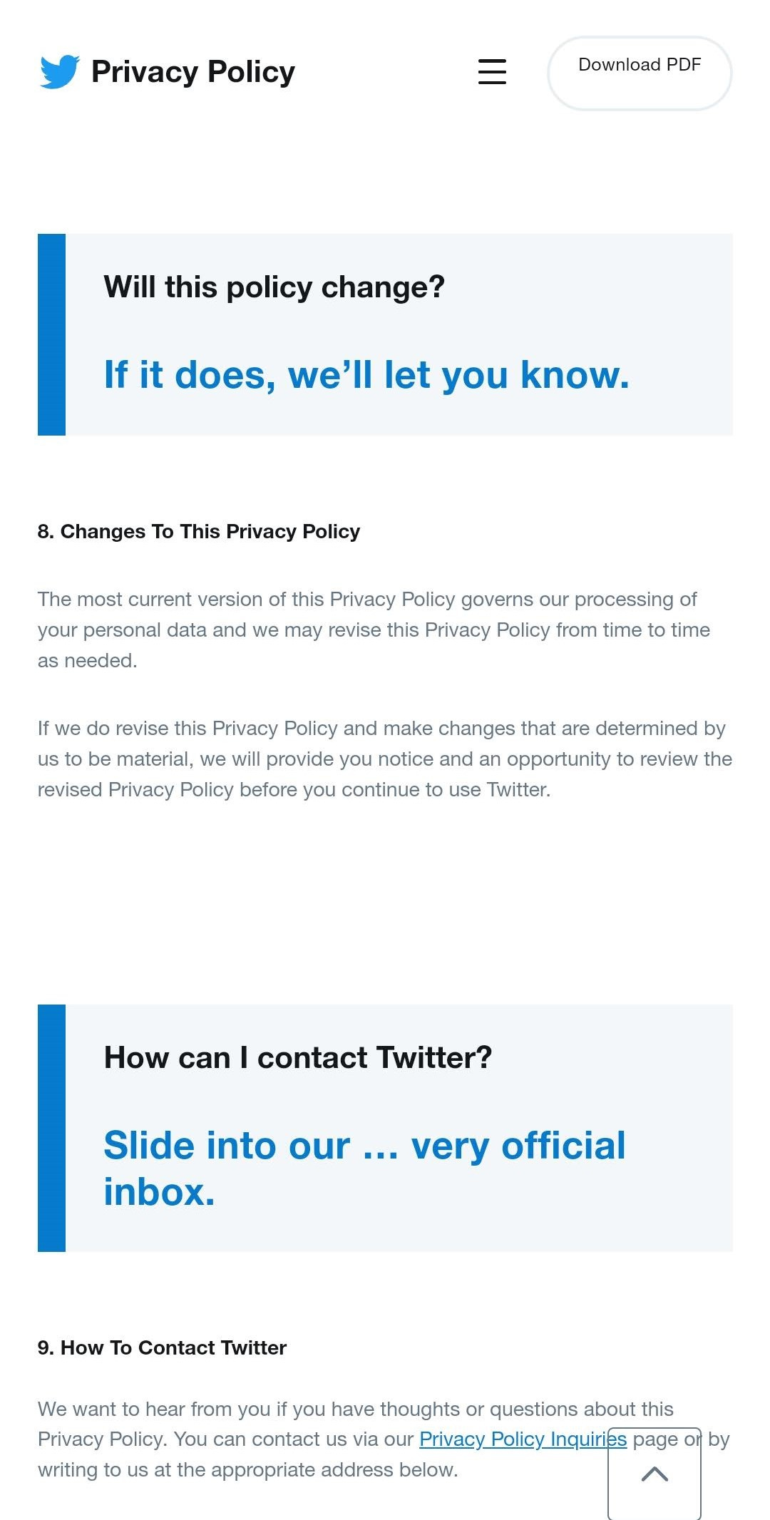
#4. This privacy policy by Twitter👍🏽
I think it was last year that I first heard about a bill being passed saying companies had to make their privacy policies (and any other T&C) easy for the general public to understand. But this is the first time I'm seeing it in practice and it's honestly very beautifully done. Excellent copywriting here.
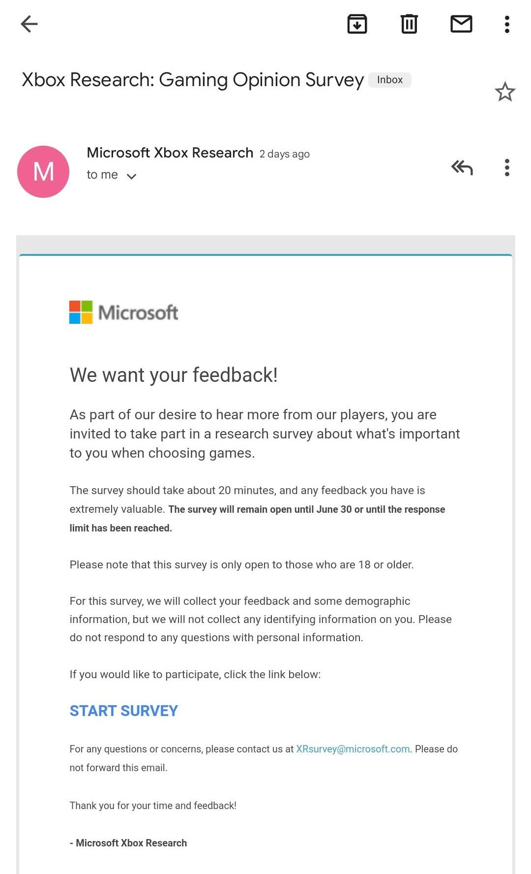
#5. This email by Microsoft Xbox👎🏽
I absolutely hated this email. 20 minutes is way too long for any kind of survey. If a survey is going to take 20 minutes, maybe it should be an interview or focus group discussion. And it should come with an incentive. I'd be very interested in seeing how many people actually took this survey after reading this email.
I ended up taking the survey (to see how long it would take) and it only took me about 3 minutes to fill. I'm hoping that means the 20 minutes here was a typo and they really meant 2 minutes. Even if that were true, it still speaks to a lack of editorial control (and it is a major mistake that will absolutely have a terrible effect on the number of people that take the survey)
Did you enjoy this email? Reply to let me know. Even better, share this newsletter with a friend
Did someone share this email with you? Subscribe here


